The past couple of months I’ve praised GUNNAR Optiks for stepping into new territories. They’ve pushed for stylish, feminine, bold, but through that they still haven’t forgot their roots. Despite Gunnar’s take on Groot being less loud than usual, it’s great to see them try to merge their ideas in new and interesting ways. Given this is a bold new territory for them, is it one worth exploring, or are they heading down the wrong path?
Gunnar Groot Marvel Edition Glasses Review Overview
Prescription Experience
Prior to talking about the glasses themselves, I want to cover on the prescription aspect since it won’t apply to everyone. Before I was able to get either pair of glasses I had to submit a current prescription. It was nice to see them verify it was current since the last time I bought glasses they didn’t even verify I had a prescription. They also requested I download a mobile app to measure my head/pupil distance. It took about 20 seconds, gave them the numbers, and they did the rest.

Since my last eye exam my prescription changed, so I can’t compare these glasses to another pair I obtained elsewhere. However, I can say with absolute certainty they’re a lot clearer than my old pair. For this reason I would personally trust them to make lens with the right prescription.
I will also note the glasses featured in this review are not prescription.
Unboxing
For those unfamiliar, Gunnar recently changed their packaging to reflect the companies new direction. Instead of having a simple white box with the company name, they feature a grayish blue and white box that matches the recently revamped website.
Inside is the glasses case, which contains everything included with the Marvel Groot glasses.
Accessories
I have mixed feelings about the Arbor Collection’s “eco-friendly” case. While the inside features the same soft protective material I’ve come to expect from Gunnar, the outside is made of cardboard, or similar material. My concern with this is longevity, and the potential for accidental damage.
It’s simply not the type of case I would want on my person in the event it rains/snows, or a wide variety of situations. All it takes is a single slip up and it goes from pristine to damaged. This is less of a concern with their usual cases, as they have a silicon/rubber coating that protects them. It’s an annoying situation given a second case defeats the cohesive experience that is great to see in sustainable products.
That said, I appreciate the thought that went into every aspect, including said case. This starts with obvious things, like the aforementioned cardboard exterior, to subtle touches like the case being noticeably thinner than their usual square holders.
Since this is a collaborative product with Marvel, there is Groot branding on the front, button, and inside flap. It’s a good mix between displaying your fandom, without making it obvious these are the Groot glasses.
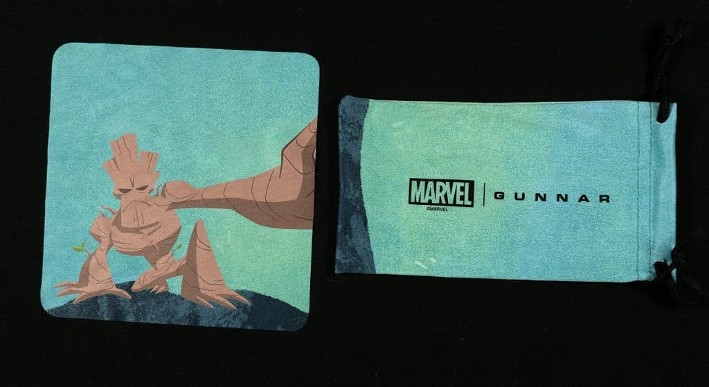

I AM GROOT
Along with the case is an “eco-friendly” cleaning cloth, and pouch that feel/function the same as their usual counterparts. Similar to the case, both accessories go for a simpler look. They also feature an Earthier palette that really completes the experience.
Design
Like other glasses in the Arbor Collection, these are made out of wood. Specifically, “sustainably harvested walnut wood material laminated to carbon fiber.” It’s a lovely color that truly captures the look of Groot without needing a wide variety of reminders.
In fact, outside of the Guardian shield on temple tip there aren’t any obvious clues this is anything besides a stylish wood frame. The only other tells is a hidden I am Groot on the inside of the opposite temple tip, a small Marvel logo a bit higher, and small thing that says Groot Walnut on the opposite side.
What surprised me the most wasn’t the subtle design, but how it differed from Muir. At first glance they look identical besides color and the two bolts, though the temple tip is also different. Instead of being a single piece of wood like Groot, the bottom half is plastic.
Comfort
What makes this choice important is two distinct things. The first is there are less concerns about longevity. I know how sweat will impact plastic, though I can’t comment on walnut. I imagine it will be fine provided proper hygiene practices are followed. However, much like the case, I fully understand this being another concern someone might not want to deal with.
The other is how the wood feels. As someone sensitive to touch, I did not consider how this natural texture would feel against my skin. At first I didn’t care for the smooth feeling. Contrary to plastic, it’s a sensation that is always present. Gunnar attempted to mitigate this by smoothing the points that touch one’s skin, yet it’s still present on some level.
Surprisingly, I found myself preferring the natural feel after an hour or so of use. There is something soothing about it. The only thing that persisted was the annoying sound it made when sliding against my hair. Due to the texture there is more of a scraping sound compared to my usual plastic frames.
Performance
Let me start by saying this review is simply based off my personal experiences with Clear 35, Amber 65, Amber Max 98, and a pair of Blokz I obtained years before. I can also confirm I’ve worn a pair of Gunnar glasses every day for over a year now.
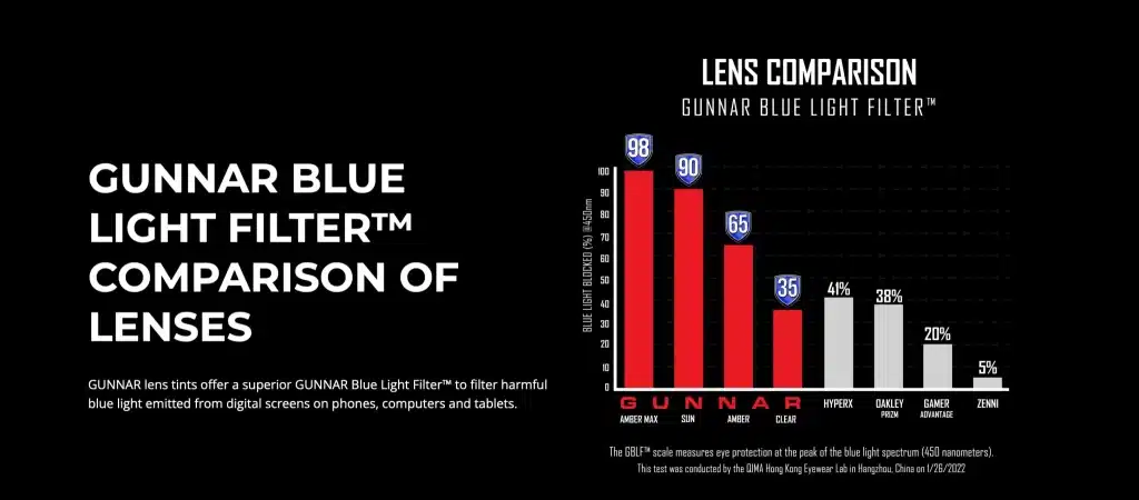
The supposed benefits of blue light blocking glasses include reduced digital eye strain, and better sleep-wake cycle. These root issues can also cause additional problems, such as headaches.
While I strongly believe these helped with my frequent headaches, I saw no additional benefits with any Gunnar lens. Even after wearing Amber 65 for months and going down to Clear 35, my sleep-wake cycle didn’t feel any different. At most there was a marginal change that wouldn’t be perceptible without detailed logs.
Lens Differences
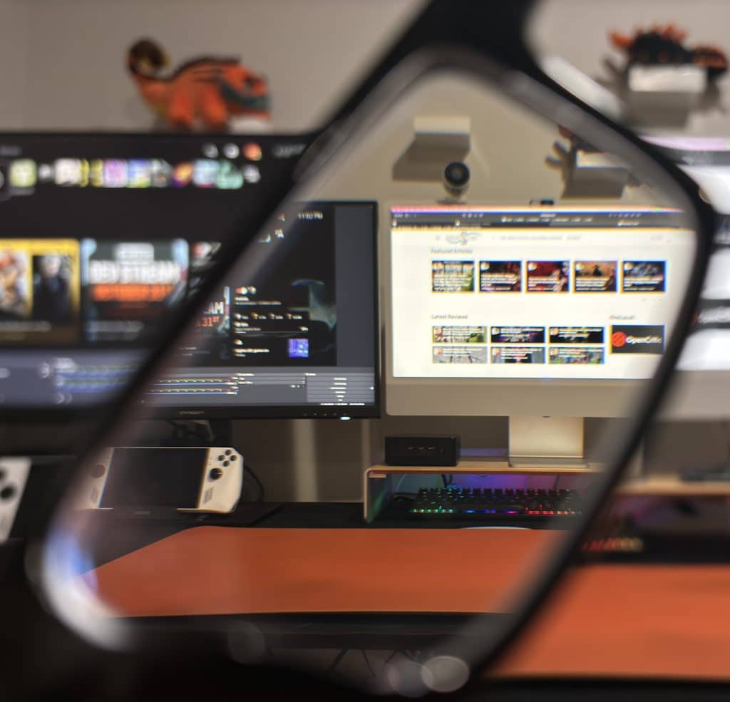
Groot Marvel Edition comes in Clear 35, Amber 65, and sunglasses. Those who opt for a prescription gain Amber Max 98 as an option, as well as Transitions. An example of how the tint changes things can be found below.

Gunnar Vertex (Clear 35) vs Normal
Having worn Clear 35 for a months, it’s surprising how quick the adjustment period is. How much of a difference it makes ultimately depends on what you’re looking at. The orange deskmat that can be seen in the photos looks identical. When fixating on a black object, such as my keyboard, there is a slight difference. The only thing that is immediately noticeable is a white background, which gains some hints of yellow.

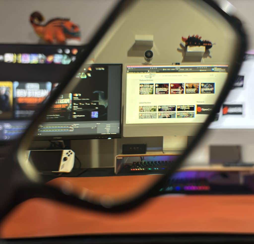
Gunnar Vertex (Clear 35) vs Gunnar Vertex (Amber 65)
The difference between Clear 35, and Amber 65 is less pronounced than one might think. Instead of being a radically different look, all the aforementioned things are simply more apparent. It just isn’t so much a white object looks yellow, similar to an aged photo.

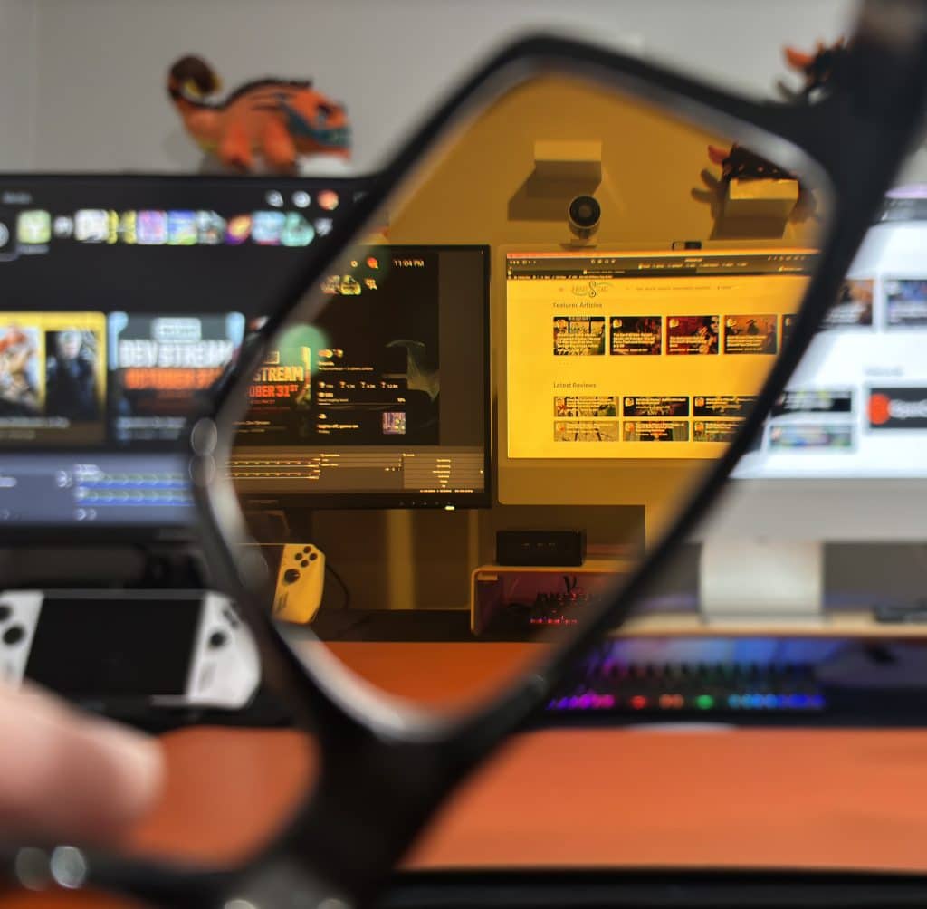
Gunnar Vertex (Clear 35) vs Gunnar Vertex (Amber Max 98)
Amber Max 98 is a lot more pronounced. Not only does it take a minute to get used to, it radically changes how things look. Worth considering if blue light blocking is the most important thing to you.


Gunnar Vertex (Clear 35) vs Zenni Blokz
Overall, there isn’t a huge difference between these two. The only advantage Blokz has over Gunnar is a lack of tint, or at least one notice.
Gunnar also released a Clear Pro lens, which is currently limited to the other Arbor Collection frames.
Reflections
One of the biggest surprises with Gunner lens is the potential for reflections. Historically this has been a test where Clear 35, and Amber Max 98 didn’t handle it as well as Amber 65.


With Groot Marvel Edition the experience was more in-line with the other two. I suspect this might have to do with this being the first Amber 65 review without prescription lens, as the best test of this, Cupertino, showcased different results.
Gunnar Groot Marvel Edition Glasses Review Verdict
I think Groot Marvel Edition is a great compromise between nerdy and stylish. There isn’t much about the frames that scream Marvel, yet the overall presentation perfectly captures the referenced character. Even if there are some shortcomings, like this really should’ve featured Clear Pro, and the case is going to be divisive, this is the type of design I hope to see more from Gunnar. One where someone can showcase their personality without being defined by it.
Editor’s Note: Gunnar Groot Marvel Edition glasses were provided to us for review purposes. Since certain elements are unchanged from our other Gunnar reviews, they were reused here. The comparison pictures use the Vertex model for consistency.


