
A recent critique from a dedicated Battlefield 6 fan has highlighted the game’s use of color filters. This analysis details how these choices affect the visual experience across the four maps available in the open beta. The fan, a YouTuber known as Vic’s Corner, offers a well-rounded commentary that respects the developers’ technical skills while pointing out where the game’s visual design might fall short.
The commentary raises concerns about the “heavy-handed” color grading. It compares the current graphics to the more vibrant and natural palette of older titles like Battlefield 1. Specifically, the critique focuses on Liberation Peak, a map where the high contrast filters are said to “crush” darker areas. This effect causes graphical elements to lose definition and blend together, which restricts visual clarity and overall player experience.
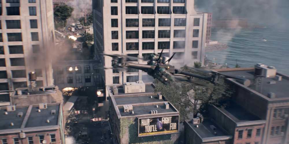
On maps like Siege of Cairo and Iberian Offensive, the fan’s analysis suggests that while the warm tones fit their settings, removing them reveals a vibrancy in the game’s assets, from soldiers to the sky. This vibrancy better matches the classic Battlefield look. The critique of the Empire State map is more nuanced, praising the variety in filters but recommending less overall saturation to highlight the map’s strengths.
This community feedback comes at a crucial time. The development team at DICE has already shown they are open to player input. They have announced several changes to gameplay mechanics based on feedback from the open beta, including adjustments to weapons, jumping, and parachute physics. The community’s strong opinions about visual issues indicate a chance for further improvements before the game’s official release. This potential change could create a more visually engaging and player-friendly experience.
